
My incredible clients NEVE Wellness just launched their business and their first product! NEVE Wellness are two sisters, Sarah and Laura. Their brand was born from a desire to create spaces and products that will support women to live with balance and vitality.
They offer plant powered skincare to get you feeling good about your skin, holistic therapies to let you unwind and re-centre, and immersive events where you can try, learn and grow with a like-minded community of women.
Discovery & Mood Board
Each project begins with a discovery phase. NEVE Wellness booked onto Unfurl your Brand, watched the short videos, and then filled in the Brand Discovery Workbook inside the online portal.
The Workbook is simply a series of questions designed to get you thinking about your brand in a slightly more structured way. It helps to focus your ideas and get them all written down in one place. There are also a few questions that are almost like journaling prompts aimed at teasing out thoughts and ideas that might not have come to light previously when thinking about your brand.
Once I’ve reviewed the info and we’ve chatted back and forth about ideas and themes, I put together a Mood Board and explanation of the Creative/Design direction we’ll be moving in. Below is just a small part of the presentation I put together.
Neve Wellness is:
A brand offering plant powered skincare to get you feeling good about your skin, holistic therapies to let you unwind and re-centre, and immersive events where you can learn and grow with a like-minded community of women.
Neve Wellness brand keywords & themes:
Down to Earth, Artisan, Simple, Modern Apothecary, Natural, Holistic, Cyclical & Seasonal, Connected, Softness & Strength.
Neve Wellness visual inspiration:
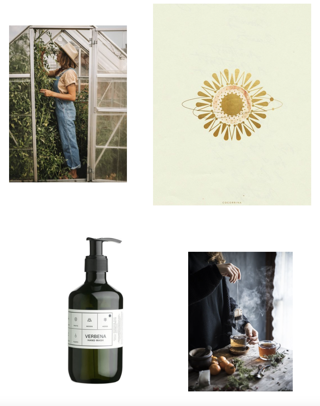
Image sources: Greenhouse, Sunburst, Verbena, Tea
Design Development

Once the discovery work was done and Sarah & Laura booked in their first design sprint weeks, I could begin designing.
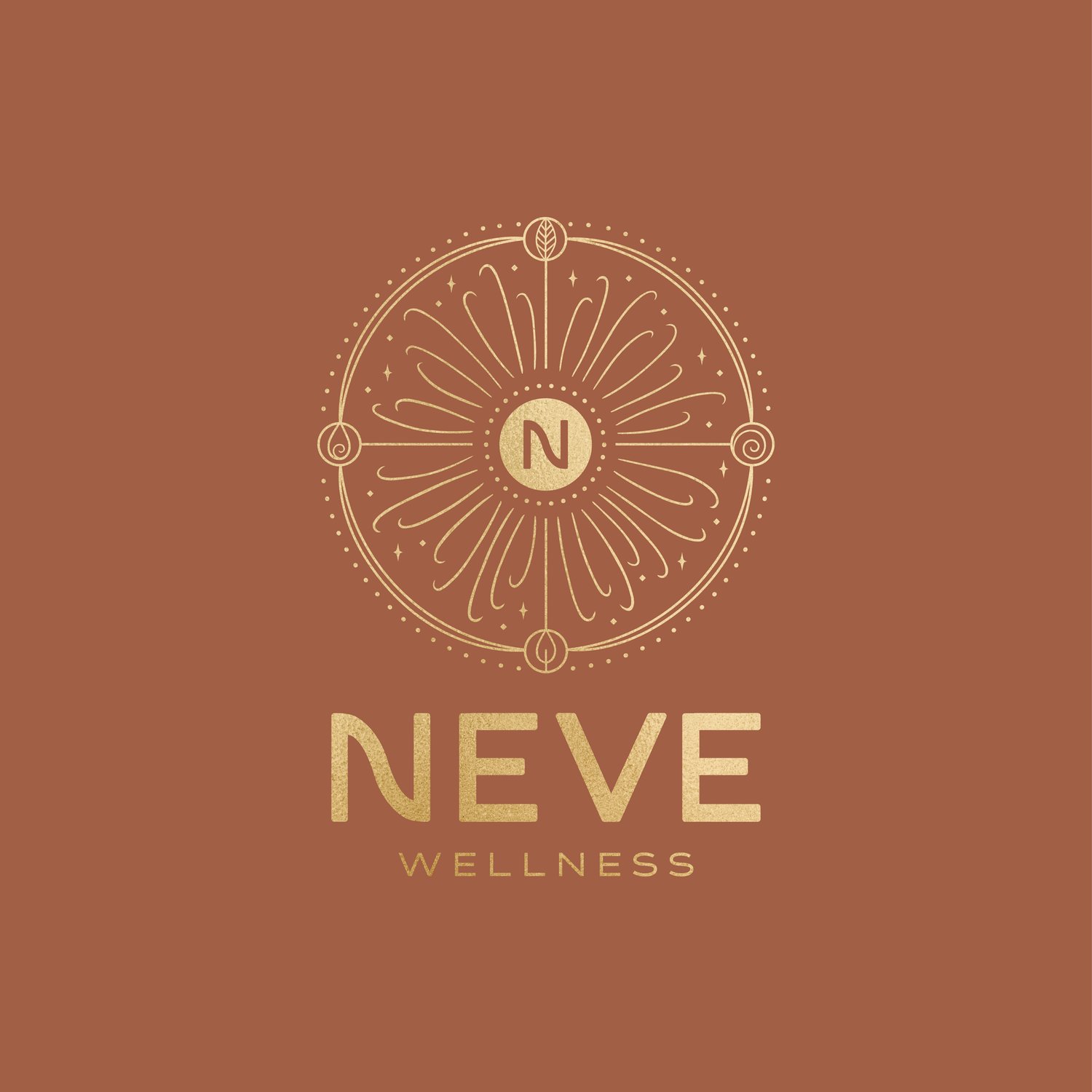
The concept sketch for the logo is shown above.
The idea of cycles and connectedness is represented by the circle. The seasons are shown both by the circle being split into 4 segments and by the 4 symbols round the edge of the circle.
The elements of Earth, Air, Fire, and Water are shown in the 4 symbols – these natural elements are the basis of all life on Earth. The heat of the sun, the earth beneath our feet, the air we breathe and the water we drink are essential to our existence. They exist in a harmonious balance and this balance is necessary for us and the planet to stay alive.
They also have archetypal meanings for us as human beings which layer up into the representing the balanced ‘whole-self’. Having the element symbols within the logo lays the groundwork for these and other small symbols to be used throughout the brand identity.
The sun at the centre has rays emanating from it, but these are curved on the end to hint at the fact that we must always cycle back round again, come back to resting and centering ourselves before using our outward energy again. The curved lines also hint at flower petals and give the overall image a feminine tilt to balance out the bold text.
The Result
The result is a meaningful logo icon that represents all the areas the brand will expand into alongside skincare as their offering grows – holistic therapies, events, and community.
The logo icon can be used on it’s own or alongside the text to create the full logo. The text works centred underneath the icon, or aligned to the right.
The overall branding has both a softness and a strength to it with both fine and bold lines, and although the lines are ‘clean’ all corners have been slightly rounded for a feminine tilt.
The label designs give a real Modern Apothecary feel which was a key theme for the brand.
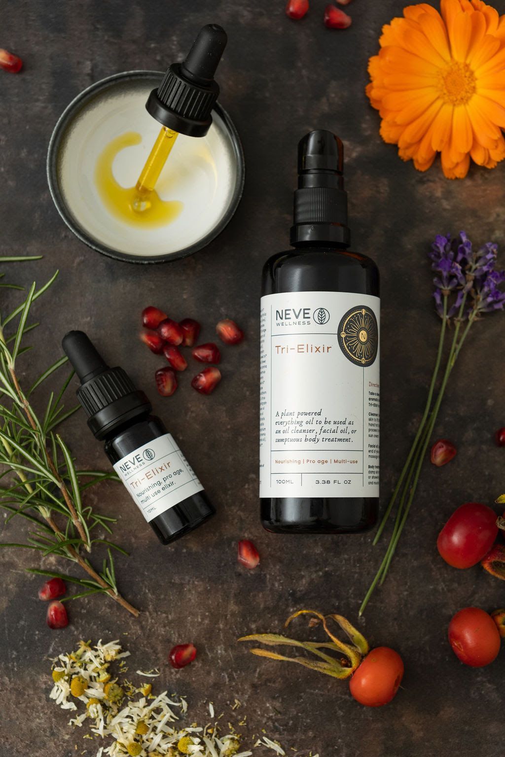
Product Photography by Amelia Jacob


Sarah’s Experience
“I really loved the process of working together, I particularly like how we worked in stages as I felt like it gave us time to reflect before moving on the next part of the process.
I thought using Voxer was an effective way to communicate as we are both busy mums and organising zoom meetings and things just wouldn’t have been as practical.
I am both thrilled and surprised with the outcome. I feel like you created something that was in my head that I hadn’t quite identified yet and I’m really grateful for that, I didn’t want to just give you a list of requirements and you turn them into the right files, I wanted to hand over my hopes and let you interpret them and I feel we did that.
I’m excited for working together again in the future!”
Comments ()