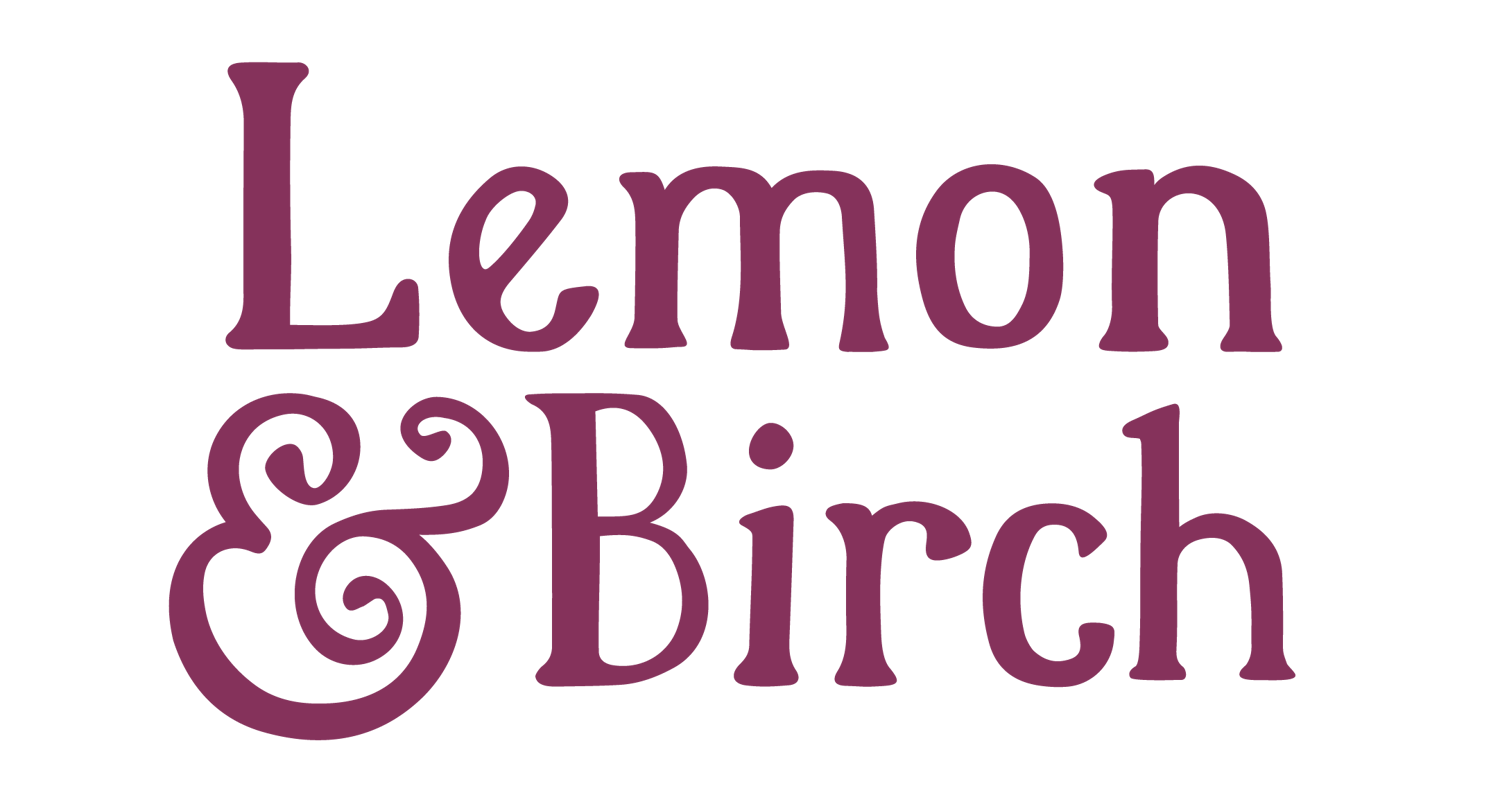

When creating typography logos either for yourself or as a designer for a client, in some cases, all you really need is one unique element to bring things to life. In this post I’ll share 6 typography logo design ideas your can try yourself!
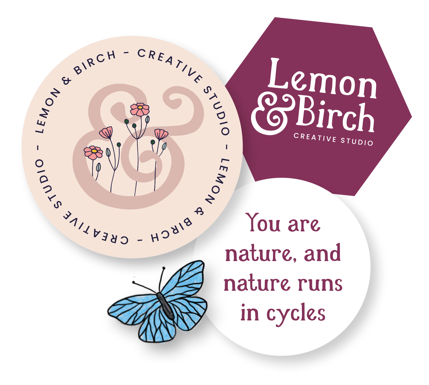
Sometimes it’s best to keep your logo design type based so that you can bring in illustrative elements in other parts of the branding like on product packaging or as elements to build into a website design.
Or, you can combine typography with other elements to take your designs to a whole new level.
There are so many amazing things you can do with typography alone to make it unique and interesting, so I’ve pulled together my top 6 typography design ideas for you!
All of the examples below are my own work and have been created inside Adobe Illustrator (or as a combination of the Procreate app on my iPad and Illustrator on the computer).
The same effects could also be achieved in Affinity Designer which is professional design software that only requires a one-off purchase and works out much cheaper than Adobe Illustrator.
1. Type onto a path
Typing onto an open or closed path in Illustrator is such a fun way to bring movement and fun into your typography!
In this first example for Tea and Crafting I’ve used this effect in each part of the text. For the main logo typography in pink, I created a wavy path with the pen tool and typed onto it. Then for the tagline I’ve typed onto a circular path.
The second word of the business name here was much longer than the first, and so adding the tagline in a circle to the left balances things out.

In this submark example for Susana Torralbo I’ve typed onto two wavy paths to create a playful and energetic look. I created a few different text layouts, then sent these layouts to my iPad Pro and opened them in the Procreate app – this allowed me to draw the faces around my typography so they fitted perfectly!
I drew in black at a high resolution, sent the png image back to my computer, ‘image traced’ the faces to turn them into a vector, and combined them with my wavy vector typography.

In this last example for Kate North Kinesiology, spirals were a big part of the brand design concept. To create this unique looking submark I carried the shape of my spiral vine on and typed onto the path I made. Simple but effective and it fits in so well with the rest of the branding!

2. Embellish your type
Sometimes you’ll find a font for a logo design that feels like it is almost perfect…but there’s just something missing. In this case, think about how you add add to your letters to create the exact feel you’re looking for.
Maybe this means cutting bits off letters from another typeface and adding them into the typeface you want to use. That’s totally ok to do and is a lot of fun! To find what works you’ll need to spend the time playing around with different things.
You can also try adding illustrative elements either by drawing them or adding details with the pen tool in illustrator.
In this first example for Folk Rose Beauty, I found two typefaces that I liked for the design and wasn’t sure which was going to work. In the end, I took those curved embellishments from one typeface and added them to the other to create the perfect balance.
I also drew in some dots and the other detail on the K to add some more interest to the other letters. It’s important to not go overboard with adding your embellishments, they don’t need to be on every letter!

In the example below for The Prairie Wellness Co the font I’d chosen was very minimal and I knew we wanted to include some Prairie wildflowers in some parts of the branding.
It looked like far too much to add flowers to every letter, but the word Prairie was luckily the perfect length to add flowers to every other letter! I took an image of my typography into Procreate on my iPad to draw the florals, then ‘image traced’ the flowers to turn them into vectors.

3. Combine uppercase/lowercase or different font styles in a unique layout
When you need to create something really unique you can try combining uppercase and lowercase letters, or perhaps regular and italic letters. You’ll often need to work hard on the layout of these letters to make sure things look balanced and are readable.
In this example for Susana Torralbo it took a while to combine things in such a way that the text was readable still. All you can do is keep combining things in different ways until the composition feels balanced. Also notice ‘Torralbo’ typed onto a wavy line from my first tip, this follows through the the submark design.

Ask other people whether it’s readable still! My husband is a great help to me, he’s not a graphic designer and so he sees things in a different way. He can instantly tell me if something looks forced or if the text is no longer legible.
In the example below for Caro, I’ve spliced a couple of fonts together, created a completely new letter A, and combined them in an interesting way for this secondary logo. Having the A almost italicised and having the straight line on the right created some nice symmetry with the letter R which makes this layout work. It also works well with the text being laid out in a straight line for the main logo.

4. Create your type from scratch
Don’t freak out when I say that, we’re not talking about creating your own serif typeface here. You can create some pretty awesome typography just with monoweight lines in illustrator.
For this example below for Artificially Intelligent Claire, I couldn’t find a typeface that had the right balance for her brand. So I created my own letters just using lines and those little squares. There is so much you could do with this especially for a brand that will suit a minimal type design and it doesn’t only have to be for techy brands like Claire’s.

5. Keep it minimal
Don’t feel like you need to go overboard with the type customisations each time. Sometimes all you need to do is make some minor adjustments to your letters.
In the example for Louise Howarth below I disconnected the middle line of the H and A, and edited the curve of the letter R. The design is super simple, and there were other logo versions that provided some more visual interest. To create a ‘high-end’ logo less is always more.

Similarly with the Balance Hot Yoga logo below, I changed the middle line in each letter A to point upwards. This made me think of a yoga pose in a very subtle way and was enough to make the logo typography unique when paired with other elements in the branding.

6. Combine letters together
This can work nicely with so many different types of fonts. Some typefaces will have extra glyphs or ligatures (in Illustrator go to Window > Type > Glyphs to access the panel that will show you any extras that came with your font) where letters are already combined for you, but you can have some fun with combining things yourself too.
In the example below for Huma Qureshi I’ve combined the U and M in the first name – be careful with customisations this and make sure each letter is still legible in it’s own right! I’ve also combined the A and H after I lined them up to fit perfectly together, play around with your spacing to see if you can get things to line up.

Again, ask others who aren’t aware already what the words say if you’re unsure if you’ve gone too far with your design.
In the example below for Brilliantly Visible, I used some extra glyphs that came with the font but customised them to fit those little dots underneath the L and E.

I hope this has given you some fun typography logo design ideas to play with for your next project. Remember to always seek balance with your typography logos and to not go overboard with embellishments and customisations.
You never want your work to feel forced. Always ask for a second opinion if you’re not sure if things work
Comments ()