
Been wondering how to create a soulful brand identity for your business? In this post I’ll talk about the simple, key principal I’ve uncovered that helps me to do this for my clients.
There’s something I’ve been trying to articulate. A feeling about what is at the heart of all the work I try to put out there for my clients, but I’ve not been sure how to put it into words.
Have you ever felt like that? There’s something you understand and embody, but you don’t quite have the words to describe it and explain it to others?
Then, I saw someone talk about art practices for painting and drawing as part of a personal course I’m taking. It finally clicked into place.
The simple, key principal I’ve uncovered for creating soulful branding
You see – what I’ve been trying to articulate is really at the heart of everything that people create. No matter if it is art, music, a piece of writing, cooking, dance, film-making, architecture…a brand identity.
The creator wants the viewer/listener/reader/taster to feel something. And we are always looking for things that make US feel something too. Things that make use feel something stand out to us.
But what exactly is it that we want to feel? What makes a piece of Art, music etc either good or…forgettable? I’d argue it’s whether there is a sense of aliveness in the piece.
Whether ‘the thing’ makes us feel alive. Whether we can see the aliveness in it. Whether we can feel the aliveness of the author or artist. By alive what I mean is that it feels like it has heart and soul. It isn’t bland.
So, how do we make what we create feel alive?
Here’s that key principle:
It’s through contrasts and differences. Subtlety mixed with boldness. Lightness and dark.
This is what I already bang on about with branding, but I’ve only just connected the dots back to why it works.
Annoyingly, if you’ve ever worked with a client or employer on any kind of design or artwork and they’ve said ‘Can you just make it pop?’ (or something to that effect) this is what they mean. It needs more contrast, more differences. It doesn’t feel alive yet.
As a person, part of what makes you so wonderful and interesting is your unique mix of personality contrasts, contradictions, and differences. This is your aliveness, your soul.
When you add contrasts and differences into your brand identity, you’re infusing your brand with heart and soul too.
How to build a sense of aliveness into your branding
Building a sense of aliveness into your brand identity through contrasts and differences can work in many ways. It’s important to note that it really is about subtlety mixed with boldness, because when you have too much ‘middle’, things can begin to feel muddy, rather than clear and alive.
Here are some ways to begin thinking about this. you don’t need to harness each way of creating contrast, there are no hard and fast rules. We’re talking about how things feel here…so feel it.
Choose your own adventure.
Colour
In your colour palette, you can quite literally choose two or three main brand colours that are opposite each other on the colour wheel.
Colours and the way they interact with each other, what they mean, and how they make us feel is so fascinating to me.
The complimentary and triadic opposite colours here create a bold contrast, so you need to make sure you have subtlety elsewhere.
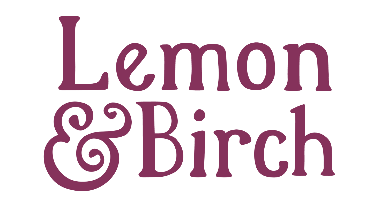
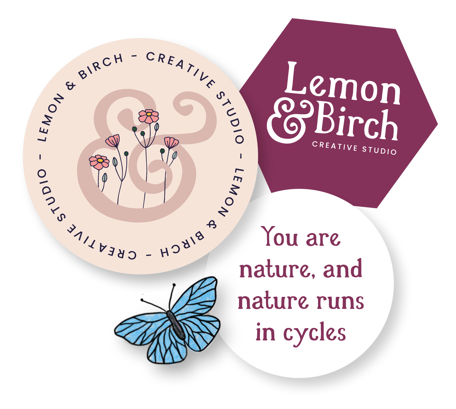
For example in my main branding for Lemon & Birch, I use a bright blue, pink, and yellow. This is roughly speaking a triadic palette, and so you’ll see less bold contrasts in other areas such as the fonts I’m using.
Apart from differences in size, the fonts I use are simple, clear, and easy to read.
If you were to use an analogue (sometimes called a harmonious) palette, these colours have less contrast between each other, and so it would be important to create bold contrasts in other areas of your branding.
It’s always about balancing boldness with subtlety.

Brand photography
This is something the photographers amongst us are already masters of. Balancing light and shadow, and framing a photograph so that there is ’empty’ space balanced with ‘filled’ space.
There are some really bold contrasts that can be created in an image when you know how to capture them. My client Caro comes to mind when I think of light and shadow play in photography.
You can also create a sense of spaciousness with your brand photography, but couple that with perhaps a detail rich illustrated logo, and you have a beautiful, balanced contrast.
Inversely, if you have busy floral photography for example, keep your logo and even your colour palette on the minimal, chilled-out side.

Image by Sophie Carefull
Typography
The typefaces you choose for your brand identity are a lovely way to bring in more contrast. You can use one type of font for headings and another type for body text.
You’ll probably instinctively be able to tell which fonts contrast with each other; but here’s some quick examples:
- Bold font weight with a lighter font weight
- A chunky slab serif with a simple sans serif
- A bold retro display font mixed with a simple sans serif
- Don’t forget how font sizing can play a role in creating contrast
- Colour can come into play with your typography too
I hope that discovering this principle has opened up a new way of thinking about branding for you, one where the rules are less constrictive.
Comments ()